Making with P5. js
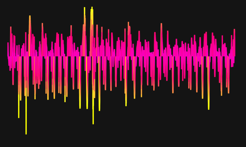
Final Program Interface Showcase
This is an embeded function, which you can directly interact with it on this page.
To making interactions, please try clicking the left mouse button and observe the changes.
If this embeded version does not work, please refer to the link above.
Inspirations
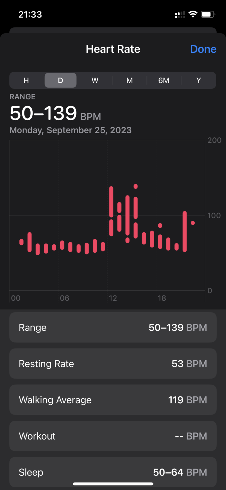
The original healthcare records from Apple are basic and lack visual appeal. These records are plain and do not convey much emotion or creativity. As a result, my main goal was to enhance the design of the heartbeat record to make it more vibrant and engaging.
Source Data
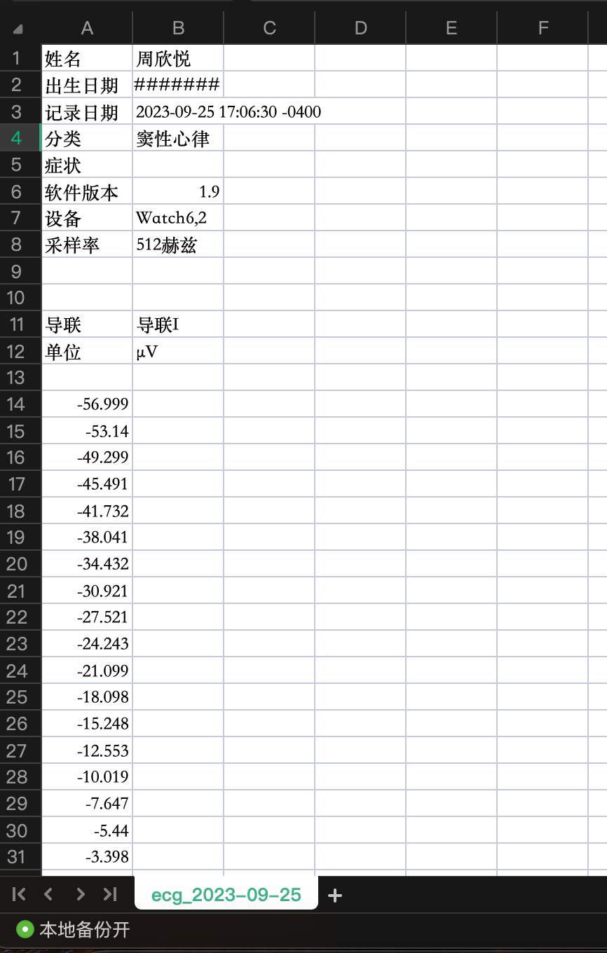
Source Data: Sinus Rhythm Recording on Apple Watch
- Record Date & Time frame:2023-09-25 17:06:30 -0400
- Category: sinus rhythm (medicine)
- Equipment: Apple Watch 6
- Software version: 1.9
- Sampling rate: 512 Hz
A total of 15,360 heartbeats were recorded (512 captured per second)
Google Form format record can be accessed at this link.
Code Showcase
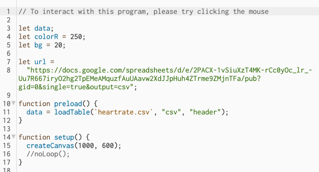
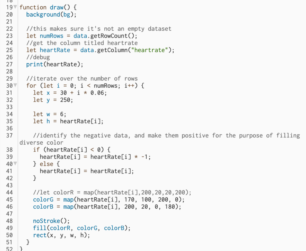
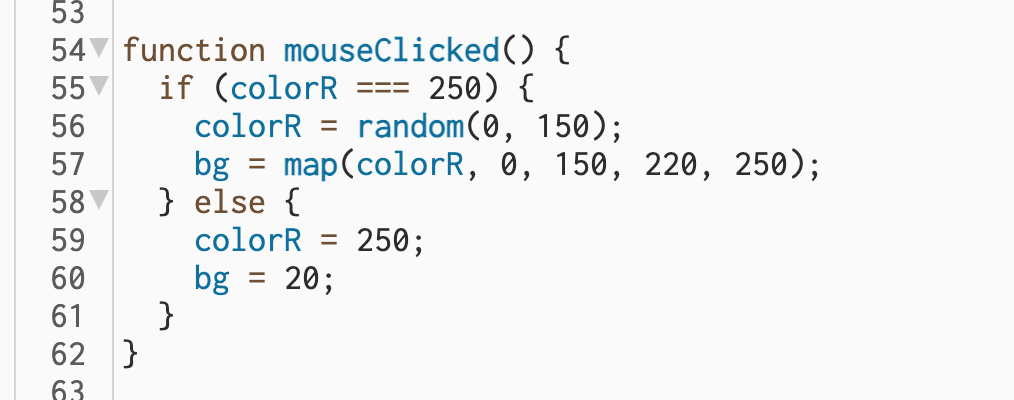
1. the general set up
including importing data and set up the canvas
2. Function draw()
- Firstly, I have included a debug feature that performs a console log and reminds me if the dataset is invalid.
- Secondly, to represent each number in the dataset, I assign its value to the height (h) of a rectangle. To avoid overlapping, I use a for-loop to horizontally map the rectangles across the entire canvas.
- Thirdly, to enhance the visual appeal of the dataset, I use the map() function to map the value of both the Green and Blue parameters in the RGB color that fills the rectangles. This makes the filling color change according to the size of the rectangle, making the dataset more readable and visually appealing.
- Lastly, to standardize the color tone of the program, I set the Red parameter in the filling RGB color to a fixed value.
3. Adding Interaction with mouseClicked()
This part of the code is about the interaction that happens when the mouse is clicked: the hue transformation of the data visualization.
I didn’t choose to change the definition of the green and blue values in the RGB colors via map() in the drawing section in order to maintain the original color style, but in order to represent a significant change, I set the value of the red in the filled RGB color to a global value (colorR) with a random() function to increase the variety, and bound the background color to the colorR with a map() function, which essentially varies with the random value of the colorR.
In such a case, each click by the user will change the color of the data visualization with the background color and the original pattern will be restored when the user clicks again.
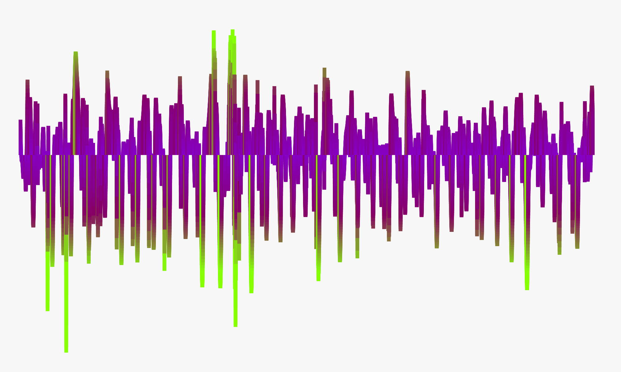
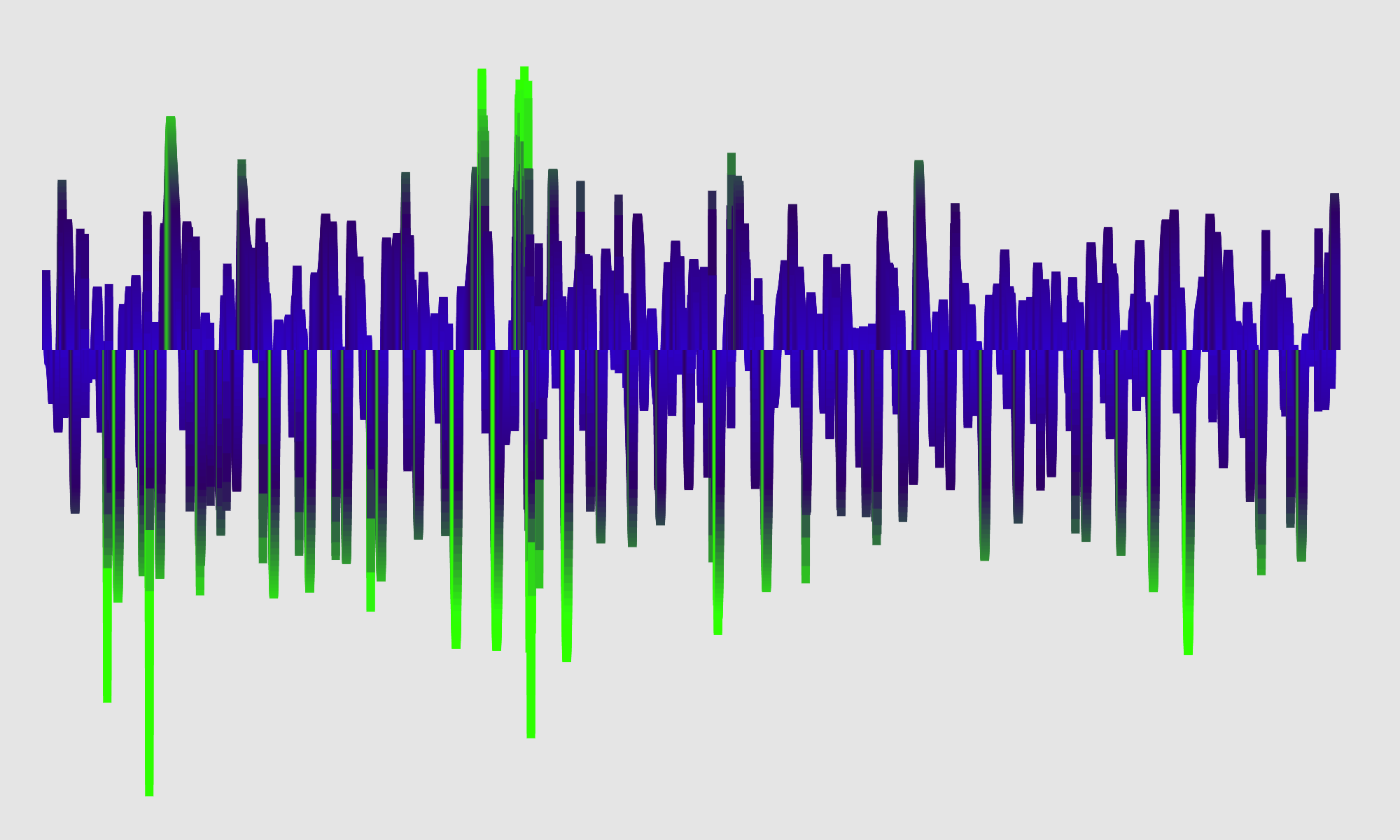
Samples of interacted outputs.
Reflection
The Storytelling Design:
The idea for this project was born out of a series of questions that I asked myself. I was curious about the hidden message behind the heartbeat, and what it represents. To me, it represents life – the act of living actively with passion and energy. I wondered how to visually capture these concepts, and concluded that colors would be the perfect medium to do so.
The original pink and yellow color scheme vividly represents a positive and energetic attitude and mindset. On the other hand, when the colors are reversed to green and blue upon mouse-click, they also indicate that being alive involves going through sadness and blueness at times. This duality of emotions is part of the human experience, and can even switch frequently within a day. As long as a person is alive, this is the routine and only pathway they will go through.de and mindset. On the other hand, when the colors are reversed to green and blue upon mouse-click, they also indicate that being alive involves going through sadness and blueness at times. This duality of emotions is part of the human experience, and can even switch frequently within a day. As long as a person is alive, this is the routine and only pathway they will go through.de and mindset. On the other hand, when the colors are reversed to green and blue upon mouse-click, they also indicate that being alive involves going through sadness and blueness at times. This duality of emotions is part of the human experience, and can even switch frequently within a day. As long as a person is alive, this is the routine and only pathway they will go through.
Challenges & Future Improvement
In my interaction design, I initially aimed to change the entire RGB color parameters instead of just modifying the Red parameter. However, I faced some difficulties in doing so with the mouseClicked function due to conflicts between global and local values. As a result, manipulating the colorG and colorB parameters became impossible. If I get a chance later, I would like to explore how the data color can be partially changed by adding a hover function.
